

Young Adult
Featured New Releases
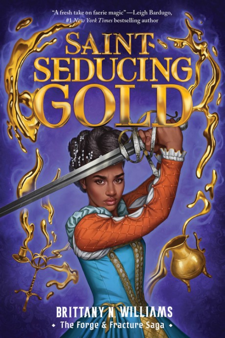
Saint-Seducing Gold (The Forge & Fracture Saga, Book 2)
$19.99
Saint-Seducing Gold is the second book in Brittany N. Williams's stunning YA historical fantasy trilogythe Forge & Fracture Sagathat New York...
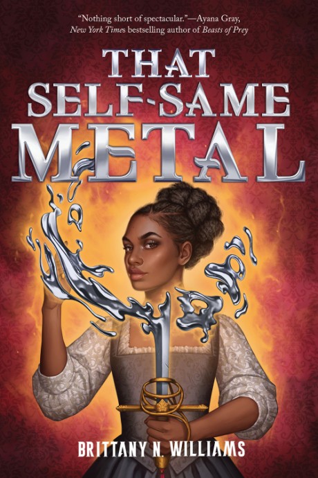
That Self-Same Metal (The Forge & Fracture Saga, Book 1)
$12.99
Thisstunning YA fantasy debut"seamlessly weaves together history, fantasy, culture, magic, and love" (New York Times bestselling author Daniel...

Dead Girls Walking
A Novel
$19.99
Sami Ellis's Dead Girls Walking is a shocking, spine-chilling YA horror slasher about a girl searching for her dead mother's body at the summer...
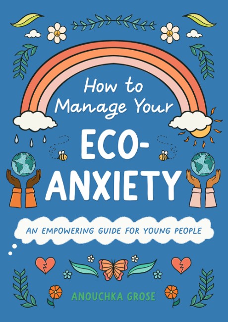
How to Manage Your Eco-Anxiety
An Empowering Guide for Young People
$18.99
How to Manage Your Eco-Anxiety is a timely book for teens that explores the relationship between mental health and the climate crisis . . . and...
All Releases
Filter & Sort